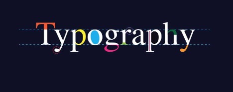
Five Typography Rules to Follow
What distinguishes professional communications from amateur ones? Details! Companies putting out professional direct mail, email, and mobile communications take the time to get it right. Here are five very common typography conventions that many companies get wrong, but that can set you apart by doing them correctly.
- Using smart quotes. Whether you are reproducing a quote or citing a magazine article, you should use smart quotes (“this”) instead of the straight quote marks (“not this”).
- Make proper use of the apostrophe. When using apostrophes to indicate that a portion of a word has been removed, the mark should always curl toward the missing material rather than away from it. For example, it’s not “Keep ‘em coming.” It’s “Keep ’em coming.” Or when referring to dates, it’s the ’90s, not the ‘90s.
- Use the correct conventions for feet and inches. When typing, many of us use straight quotes to refer to feet and inches. But the proper convention is to use what are called “primes,” which tilt at a slight angle. Instead of typing 5′ 6″, type 5′6″instead.
- Properly set fractions. Like straight quotes instead of primes, many of us type fractions using the slash mark (1/2 or 1/4). However, most typefaces have dedicated glyphs for the most commonly used fractions. For example, ½ and ¼.
- Multiplication ‘x.’ Oh, that pesky math! Like fractions, there is a convention for that multiplication ‘x.’ Instead of referring to 8 ½ x 11” sheets, it should be 8 ½ × 11”.
Use this simple checklist to clean up your typography and ensure that it looks it’s absolute best. When everyone else is getting it wrong, you want to stand out by getting it right.
Print Still Works, Printing your direct mail with proper typography can make it stand out.


